
Search Engine Optimization
Hi! Kicking off this first post of Hahn Design Studio’s Words from the Roost to talk about some new(er) developments in Search Engine Optimization (SEO). SEO is the practice of optimizing your website to a set of guidelines created by the major search engines, including Google, Bing, Firefox, Safari, etc., to improve your ranking on user searches. Most users usually find what they need in the first two to three pages of listings, so improving your ranking increases your chances of a click. Some of these guidelines include adding alternative text to images (alt tags), personalizing the meta tags for each page on your site, using true language in your paragraphs, and much more. Google still has the lion share of online search engine traffic, so complying with their requirements should be at the forefront of every businesses’ website strategy.
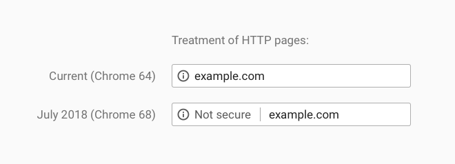 Of note, Google has been updating the way they rank and display websites at a much more rapid pace. In July 2018, they announced that websites without a Secure Sockets Layer (SSL) certificate would have the marker of Not Secure shown on Chrome browsers. SSL certificates provide secure, encrypted communications between a website and an internet browser, and sites with an SSL certificate show up as HTTPS:// versus HTTP://. Google added https as a ranking signal in 2014, but it only affected 1% of websites. There is no definitive indication of the value of the HTTPS ranking signal in 2018, but having an HTTPS website correlated strongly with showing up on first page listings.
Mobile-first Indexing
Today, Hahn Design Studio received this email from Google Search Console that indicated our website will be ranked by how our website renders on a mobile device. Google announced mobile-first indexing in 2016.
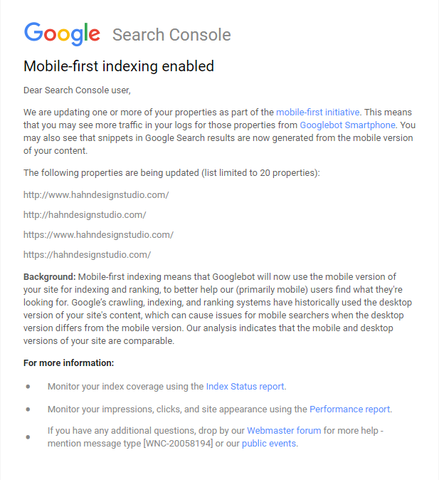
“Background: Mobile-first indexing means that Googlebot will now use the mobile version of your site for indexing and ranking, to better help our (primarily mobile) users find what they’re looking for. Google’s crawling, indexing, and ranking systems have historically used the desktop version of your site’s content, which can cause issues for mobile searchers when the desktop version differs from the mobile version. Our analysis indicates that the mobile and desktop versions of your site are comparable.”
Importantly, we designed our website to be responsive so that it renders well on both a computer screen and a mobile device. Google Search Console’s email indicates that our site is comparable on both a computer and mobile device so our rankings should not be adversely affected.
What does this mean exactly?
According to Google’s Google Webmaster’s Twitter, here is a description of the actual changes that happen:
- URLs in search: With Mobile-first indexing, we index the mobile version. When we recognize separate mobile URLs, we’ll show the mobile URL to mobile users, and the desktop URL to desktop users – the indexed content will be the mobile version in both cases.
- Crawled counts: The total number of crawled URLs/day generally won’t change, but the balance will shift from mostly-desktop to mostly-mobile crawls. During a switch-over to mobile-first indexing we may temporarily crawl more as we reindex everything.
- Cached page: Unfortunately, it looks like we’re currently still not showing a cached page for many mobile-first indexed sites. This is a bug, not by design, and should get resolved over time. It’s just the UI, it doesn’t affect crawling, indexing, or ranking.
- Speed and mobile-first indexing: The mobile speed update in July is independent of mobile-first indexing. Fast sites are awesome for users, especially on mobile, since devices & connections there tend to be slower than with desktops.
- Mobile website UIs: Using “hamburger-menus” and “accordions” on mobile websites is fine.
- On requirements: Neither mobile-friendliness nor a mobile-responsive layout are requirements for mobile-first indexing. Pages without mobile versions still work on mobile, and are usable for indexing. That said, it’s about time to move from desktop-only and embrace mobile. [The subtext is that if your site is not mobile-friendly, it will STILL be changed to mobile-first indexing even if it hurts your current rankings.]
What does that mean for you?
Even if your sitemap has not been added to Google Search Console, mobile-first indexing will be applied to your website to use the mobile version of your website on Google Search listings (if it hasn’t already). Our email was our official notification from Google about the change to mobile-indexing. Getting changed to mobile-first indexing will not automatically tank your rankings. As noted by the official Google Webmaster blog, “As always, ranking uses many factors. We may show content to users that’s not mobile-friendly or that is slow loading if our many other signals determine it is the most relevant content to show.” Content is always key, but it needs to be displayed properly. Eventually, if your website is not mobile-friendly, your site will rank lower than your competitor’s mobile-friendly site in search listings. If you would like to discuss your website and current SEO challenges, give us a call or contact us. We love talking about this stuff.
Leave a Reply